
After reading a rogue tweet by dataist-in-chief Chris Wiggins, I figured I’d finally dig into the reams of Citibike usage data I’ve been collecting for the better part of a year. He claims it’s finally Citibike weather, and to that I say, show me the data!
Our data comes from two sources. For Citibike usages, I’ve got a public Graphite instance at data.citibik.es that scrapes Citibike usage every minute, and for temperature, I used Wunderground’s pretty awesome api.
With these two sources, let’s see if Chris was right! Our null hypothesis will be that there is no such thing as Citibike weather, so we’re going to try and see if temperatures are not correlated to the number of Citibike trips taken. I don’t have access to trip level data, but I do have the next best thing: the number of available bikes and docks at each station. Here’s one series for the station at Henry St. and Grand St.:
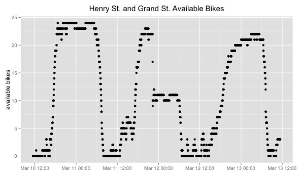
We can see that there are lots of available bikes around midnight, and much fewer available bikes in the afternoon, just like you would expect - people don’t usually ride Citibikes after midnight.
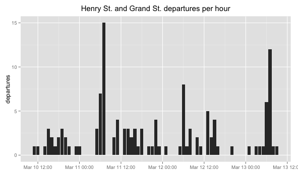
However, knowing the available bikes doesn’t really help us too much - we need to figure out the number of trips taken if we want to do this analysis. Luckily, we can infer the trips by figuring out the number of departures and arrivals. After all, a “trip” is nothing more than one departure and one arrival, anywhere in the system. So, if we take our original series and decompose it into a set of events (every time the number of available bikes increases, for arrivals, and decreases, for departures), we can then collate these events to get an idea of how many trips were taken over a given period of time.
Below, I’ve graphed the departures for Henry Street:
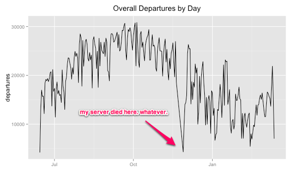
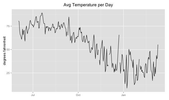
Of course, we’ll need to do this for every station in the system. Here are the departures per day across the entire Citibike network, for the duration of my data collection:
And let’s go ahead and show the temperature while we’re at it:
Now here are the two together:

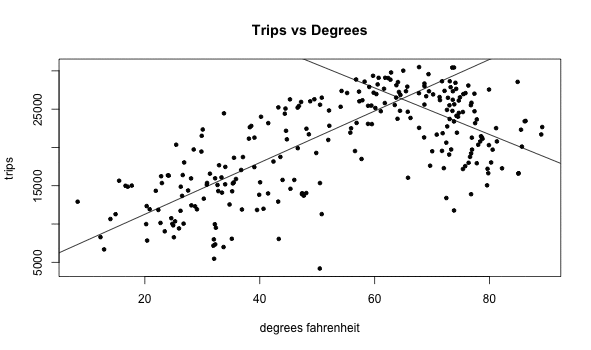
This is getting pretty juicy. I see a nice positive trend, but I also see what looks like a changepoint around 75 degrees, after which it looks like trips taken are inversely correlated with the temperature. Let’s see what the cross correlation plot looks like:
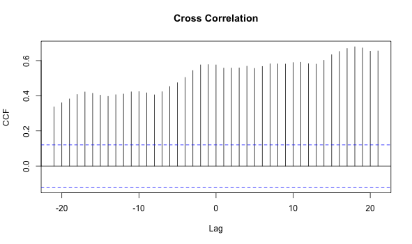
We can see that upper bound on the 95% confidence interval is about 0.12. At lag 0, we get a value of .60 - pretty promising! We’re well within our rights to reject the null hypothesis and conclude that temperatures are in fact correlated with trips taken. However, there’s a bit of funkiness in this plot - you can see that instead of the correlation coefficient decreasing as lag increases after 0, it increases!
This could be because of that changepoint I mentioned above. I bet that if we figured out where the changepoint is, and then calculate correlations on the two subsets (before and after the changepoint), we’ll end up with two much better looking correlation plots.
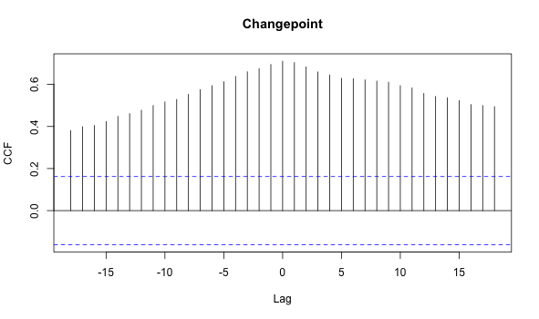
To find the changepoint, I used a basic gradient descent technique: for every degree fahrenheit, I divided the population into two subsets (pre and post) and calculated correlation coefficients for each subset. I then chose the two subsets whose summed correlation coefficients were the highest.
Here we can see the process go, and I’ve highlighted the plot with the winning correlation coefficients:
It looks like the changepoint is actually at 61 degrees, not 75. Here are the cross correlation plots for the pre and post subpopulations:
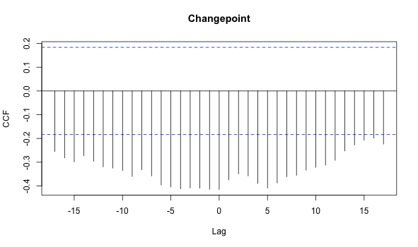
These both look great: peaks at zero lag, which is just what we’re looking for.
My gut says something still isn’t quite right, though. 61 degrees seems low. Maybe our data are biased somehow? Let’s think - in the beginning of the Citibike program, the bikes were plagued with technical problems, and the system was certainly not acting at full capacity. This happened in June when the weather was pretty warm, so maybe we’re getting a lot of artificially low trip numbers at higher temperatures. What if we discarded the first thirty days of data?
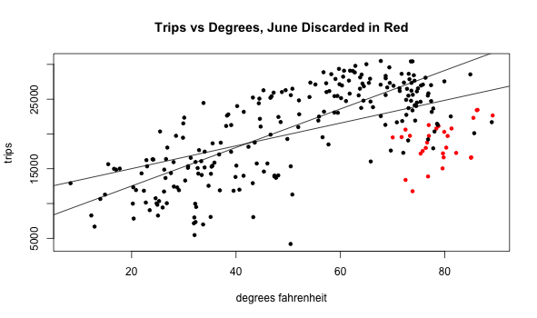
Look at that! Our original changepoint disappeared, and the changepoint it found is now something much more benign. We can ignore it for now. Here’s the final cross correlation plot, with June discarded:
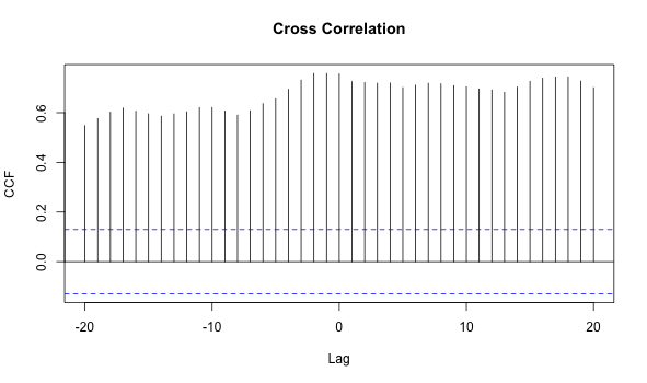
We see a decent peak in the middle this time, and much less of a lead near lag 20. The correlation coefficient is .75, which is much better than the .60 we found before.
So! We can confidently say that temperature is in fact correlated with Citibike usage, and we’ll have to wait until summer to get more data if we want to explore if there is in fact a changepoint as temperatures increase. In the meantime, let’s congratulate Professor Wiggins for publishing reproducible research. #science!
BONUS ROUND:
Wunderground provides more than just temperatures - we can get all kinds of things, like precipitation. Here’s a scatter plot showing how precipitation plays a role in Citibike usage:
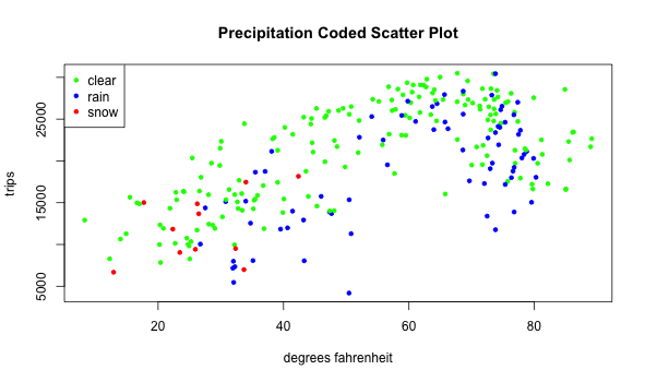
We can kind of see how rainy days tend to have fewer rides than clear days of the same temperature. Who’da thought?!
The code and raw data are available here. Thanks to Chris Wiggins for reviewing this post, and also being a great sport.