
When we want to think about anomaly detection in timeseries (in a web operations context, at least), we want to be sure we’re thinking about detecting shifts in probability density functions, as opposed to simple outliers. The reason for this is that spiky outliers of one or two datapoints are not often actionable, so alerting on them is silly. It’s useful to know about spikes, because they still represent systemic processes that may be detrimental to our infrastructure, but they usually don’t represent fundamental shifts in the underlying processes that need to be dealt with immediately. Instead, they are simply very rare occurrences of an otherwise normal system.
Let me elaborate on the distinction. We can imagine that we’ve got a nice systemic process described by data like this:
x <-ts(rnorm(n=400, m=10, sd=.2))
plot(x,  xlim=c(0, 400), ylim=c(8, 15))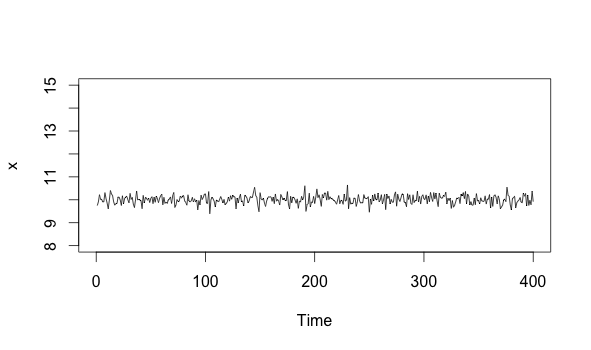
Now imagine that we see a spike, and then it goes away:
x[200] = 14.5
plot(x,  xlim=c(0, 400), ylim=c(8, 15))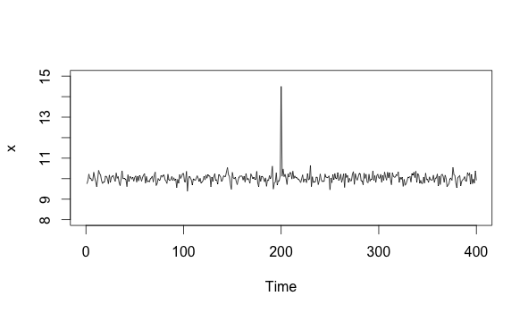
As we can see, the timeseries returns to what it was doing before. This means that the process is fine. The spike, while anomalous, was not a cause for alarm. It requires eventual action in the form of optimization and bug hunting, but it doesn’t require immediate action.
Contrast that spike with something like this:
x <- head(x,-201)
state_change <-ts(rnorm(n=200, m=14.5, sd=.2))
combined <- ts(c(x, state_change))
plot(combined,  xlim=c(0, 400), ylim=c(8, 15))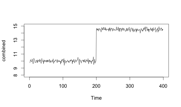
We can see that the timeseries above first acts normally, with a mean around 10. It then jumps up to about 14.5, and stays there. This “step” becomes the new normal. This is a probability density function shift, and it represents a fundamental state change in the underlying process.
Let’s dig into this a bit more. First, a definition: a probability density function (aka PDF) is a function that describes the theoretical underlying distribution for any set of values. You’ve seen them before - the normal distribution bell curve is an example of a PDF that describes a Gaussian process. When we deal with real data, we use a histogram to visualize the actual distribution, which should roughly reflect the theoretical model.
Now, if I take a histogram for the first part of the series, I get this:
hist(x)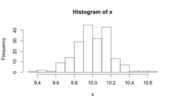
If I take a histogram for the second part of the series, I get this:
hist(state_change)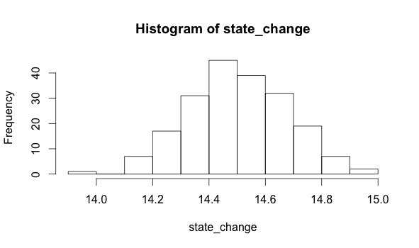
The data that produce these two histograms are each described by different parameters. A parameter is just a property of data. For example, the mean of a population is one parameter you might be familiar with. We can see that the mean of the first distribution is 10, while the mean of the second is 14.5. Detecting a change of mean is one technique we can use to figure out if we have experienced a PDF shift.
Of course, there are many more techniques, but the point is that we need to make sure that we’re specifically looking for changes to the PDF. This is a lot harder to do than detect simple outliers, but the upside is that it will give us much more powerful monitoring tools. For example, it’s the difference between your service being unavailable for a single person due to a random request timeout and your service being unavailable to your entire user base due to a fried hard drive. The former represents an outlier in an otherwise normal system - it doesn’t need to be alerted upon. The latter represents a fundamental state change in the underlying system - it does to be alerted upon, because it most likely requires immediate action.